

With WordPress gaining in popularity at an exponential rate, there are more and more sites out there running on WordPress. Some are running on pre-made themes, and some are running on custom designs.
Regardless of how your WordPress Site’s design will be implemented the following 5 WordPress Design Tips will help you organize your content, get more return users, and have a better WordPress experience.
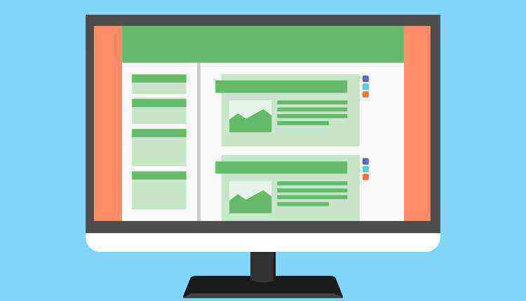
1. Post Layout

WordPress Design can be a little different
In WordPress chances are you are going to have to layout posts (unless your site is 100% a CMS with no blog). This is challenging in and of itself. How do you best accomplish this?
There are a few simple rules you can follow to help your posts be more readable:
- Consistency – Make sure your index, single, and archive pages all lay the posts out in a similar manner. There is nothing more annoying for a user than expecting information to be in one place and then finding it in another.
- Meta Information – The meta-information about a post (author, category, tags, etc.) is important, but don’t let this information distract from the reason the user is here in the first place – the content.
- Title – Make your title larger and differentiated from the rest of your post. On a non-design related note – make your title short, descriptive and eye-catching.
- Division – Make sure there is a clear division between posts so people can clearly know when they are reading about a new topic
2. Colour Scheme

No, green text on a red background won’t look good.
There are several things to consider with colour on a website. What is your website about? If it’s about sunshine and unicorns, you probably don’t want to use black and green as your 2 main colours. Likewise, if your site is about death metal music you’re probably not going to use pinks and purples.
Besides setting the mood of your site, you want to make sure your colours go together and make the site readable and usable. For instance, you don’t want to put a yellow text on a light green background. I generally advise making your content a darker colour on a lighter background (black and white are totally appropriate here, don’t get too creative with your content layout). This also helps people who might be colour blind to read your content.
3. Layout
Think Like a User
Who is going to be visiting your site? If you have no idea, you should ask yourself “Who do I want to use my site?”. The answer to this question is the most important design-related question you can ask – and it has nothing to do with colour schemes or graphics!
The layout of your site is how your WordPress site is going to be organized. Will you have 2 sidebars with a single content area? Will you have 1 large content area with no sidebars? Will you have horizontal or vertical site navigation. Are you going to have advertising, if so, where will it live? These are all questions you need to ask yourself before you even begin designing your site or choosing a theme. Questions like these are things we ask every one of our clients, and it’s surprising how many people have never even considered their target audience.
Regarding layout, generally, I advise that you only budget room for essential items. On most any site the content should be taking up the bulk of your layout. This is what your visitors come for. Also, see 3 WordPress Plugins To Optimize Performance.
4. Sidebar Design in WordPress
The Sidebar is NOT a Christmas Tree!
I’ve said it before, and I’ll say it again – The WordPress Sidebar is not a Christmas tree, so don’t treat it like one by hanging stuff all over it. Just because your theme has 5 widget ready sidebars does not mean you need to use them all. You do not need a giant calendar of your posts when you only post once a day. Make sure any widgets you are using are adding value and usability to your site.
That huge, 3-d, rotating tag cloud (where it’s impossible actually to click on a tag) is NOT adding value to your site.
If you don’t think your target audience needs a widget, get rid of it. If you can fit all of your sidebar content into 1 sidebar, then use 1, not 2.
5. Form Layout

Good Forms = More Conversions
A study was recently done that showed that people liked simply laid out, intuitive forms. This means take the most straightforward approach. People did not care how long a form was, and they just cared that it was simple to follow.
The study found that vertical forms – title above a form field with each being a block-level element, were the easiest to follow. This layout follows the normal inclination to read a page top-down.
By laying out your forms in a simple, intuitive manner, you can increase your conversions (whatever those may be), increase interaction with your site, and ensure that you will have more repeat visitors.
